Color Is a Business Decision: The Strategic Science Behind High-Performing Brand Identities
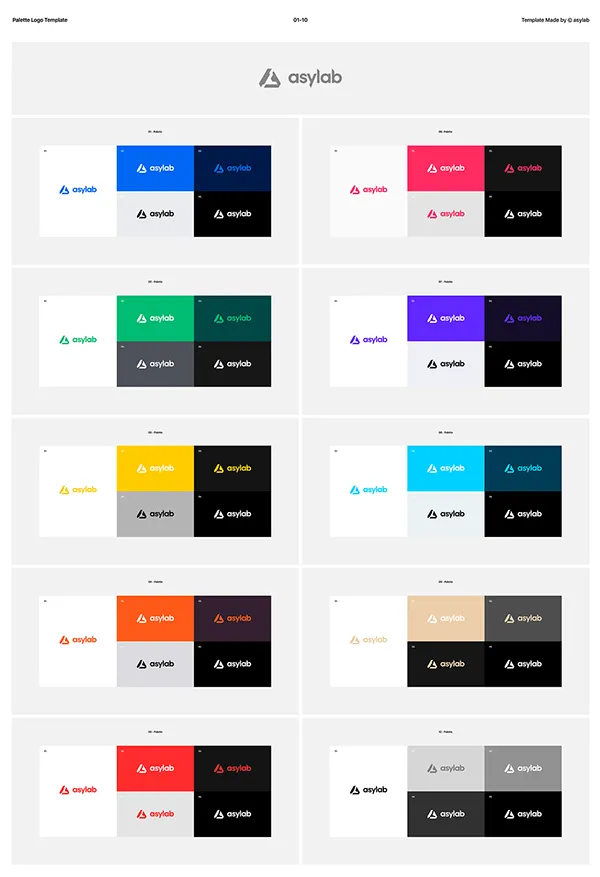
Photo: corporate brand color palette design strategy professional, via i.pinimg.com
When a consumer locks eyes on a brand's logo for the first time, approximately 90 percent of that initial judgment is shaped by color alone. That statistic, drawn from research published in the journal Management Decision, is not a curiosity — it is a mandate. For organizations that treat color selection as a finishing touch rather than a foundational strategy, the cost is paid in diminished recognition, diluted trust, and missed revenue.
At CBM Design Group, we approach color not as decoration but as a core instrument of brand communication. Understanding the psychology behind it is the first step toward deploying it with purpose.
Why the Brain Responds to Color Before Logic Does
The human visual system processes color in milliseconds — far faster than language or conscious reasoning. This is not accidental; it is evolutionary. Colors carry deeply embedded associations that span culture, biology, and lived experience. Blue, for instance, activates neurological pathways associated with reliability and calm. Red triggers urgency, appetite, and arousal. Green aligns with health, growth, and environmental stewardship.
These are not arbitrary connections. Research in neuromarketing has consistently demonstrated that specific hues influence heart rate, cortisol levels, and even spatial perception. For a corporate brand, this means that every color decision is, in effect, a decision about how customers will feel in the presence of your organization — before a single word of copy is read.
The practical implication is significant: color alignment between a brand's visual identity and its core value proposition measurably increases consumer trust. When the two are misaligned, the cognitive dissonance that results erodes credibility in ways that are difficult to quantify but impossible to ignore.
Case Study: How UPS Turned Brown Into a Competitive Advantage
Few color decisions in American corporate history are as instructive as UPS and its signature brown. On the surface, brown is an unlikely choice — it lacks the vibrancy of FedEx's purple and orange or the boldness of DHL's yellow and red. Yet UPS transformed a seemingly unremarkable hue into one of the most recognized brand assets in the logistics industry.
The strategy was deliberate. Brown conveys dependability, earthiness, and solidity — qualities that map precisely onto what a shipping and logistics company needs to communicate. Rather than fighting the color's understated nature, UPS leaned into it, building an entire visual system — vehicles, uniforms, packaging — around a single, unwavering palette commitment. Their now-iconic tagline, What Can Brown Do for You?, did not merely reference a color; it weaponized it.
The lesson for corporate clients is clear: the power of a color lies not in its inherent appeal but in its strategic alignment and consistent deployment.
Target's Red: A Master Class in Emotional Positioning
Target Corporation offers another compelling example of color deployed with surgical precision. The retailer's use of red — specifically a vivid, high-saturation red — serves multiple psychological functions simultaneously. Red commands attention, stimulates energy, and creates a sense of urgency that subtly encourages purchase behavior. In a retail environment crowded with visual noise, Target's consistent use of red across its logo, signage, marketing materials, and even seasonal campaigns creates an immediate and emotionally charged point of recognition.
Beyond recognition, Target's red differentiates the brand from competitors like Walmart (blue, connoting value and stability) and Amazon (orange-inflected, suggesting accessibility and speed). The color positions Target squarely in the space of energetic, aspirational retail — a brand that feels both affordable and stylish. That positioning is not achieved through copy or product alone. It is engineered through color.
The Danger of Color Trends Without Strategic Grounding
One of the most common mistakes organizations make is selecting colors based on what is fashionable rather than what is functionally aligned with their brand promise. The rise of gradient palettes and muted earth tones in recent years has led many brands to adopt similar visual languages, resulting in a homogenized marketplace where differentiation becomes increasingly difficult.
A design agency worth its expertise will always anchor color recommendations in audience research, competitive analysis, and brand positioning work — not trend reports. The question is never what looks current but rather what communicates accurately and memorably to this specific audience in this specific competitive context.
This is where the discipline of color theory intersects with the broader discipline of brand strategy. Hue, saturation, and value are not chosen in isolation. They are chosen in relationship — to competitor palettes, to cultural context, to the emotional register the brand must occupy.
Building Color Systems That Scale
For enterprise-level organizations, color strategy extends well beyond the primary logo palette. A robust brand color system accounts for primary, secondary, and tertiary colors; digital and print specifications; accessibility compliance (WCAG standards for contrast ratios); and application guidelines that ensure consistency across every touchpoint — from a Fortune 500 annual report to a mobile app interface.
Inconsistency in color application is among the most damaging — and most preventable — sources of brand erosion. When a brand's blue appears differently across its website, its packaging, and its trade show materials, the cumulative effect is a subtle but persistent signal of organizational disorganization. Consumers may not consciously identify the inconsistency, but they register it.
At CBM Design Group, our brand identity engagements include comprehensive color system documentation precisely because we understand that the value of a well-chosen palette is only realized through disciplined, system-wide application.
What This Means for Your Organization
If your current brand palette was selected without a formal strategy process — or if it has never been audited against your current market position and competitive landscape — there is a meaningful opportunity to capture value that is presently being left on the table.
Color is not the entirety of brand identity, but it is among the most immediate and emotionally potent elements within it. For bold brands operating in competitive US markets, the difference between a color palette that performs and one that merely exists can translate directly into consumer preference, brand recall, and ultimately, revenue.
The science is established. The strategic frameworks are proven. What remains is the decision to treat color as the business asset it genuinely is.
