Disruption by Design: How Strategic Imbalance Gives Ambitious Brands a Competitive Edge
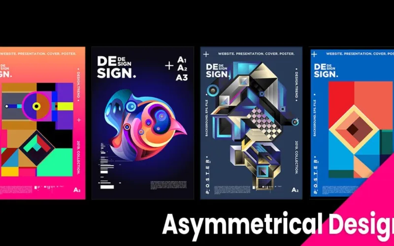
Photo: asymmetric bold graphic design layout branding agency, via kirkgroup.com
The Comfort Trap of Balanced Design
For decades, the default setting for corporate visual identity has been balance. Centered logos. Symmetrical layouts. Evenly weighted compositions that radiate stability and professionalism. These are the visual signals that say, in effect, we are trustworthy, we are established, and we will not surprise you.
For certain categories — healthcare, financial services, legal — that reassurance carries genuine strategic value. But for the vast majority of brands competing in dynamic, crowded markets, symmetry has quietly become a liability. When every competitor in a category employs the same visual grammar, the result is not professionalism. It is invisibility.
Strategic asymmetry offers a different path. Not chaos. Not carelessness. Rather, a deliberate and disciplined use of imbalance that introduces psychological tension, directs the viewer's eye, and creates the kind of visual intrigue that symmetrical compositions are, by their very nature, incapable of generating.
Why the Human Eye Is Wired for Imbalance
Neuroscience has long established that the brain responds more actively to unexpected stimuli than to predictable ones. When a visual composition is perfectly balanced, the eye completes its scan quickly and moves on. There is nothing to resolve, nothing to investigate. The composition, however polished, is processed and forgotten.
Asymmetry disrupts that pattern. An off-center focal point, a deliberate weight imbalance, a composition that leans into tension rather than resolution — these elements force the brain to engage. The viewer's eye searches for equilibrium it cannot quite find, and in that searching, attention lingers. Recall improves. Emotional response deepens.
This is not a fringe theory. It is the underlying logic behind some of the most recognizable brand identities in American commerce. Consider how many high-performing consumer brands — particularly in technology, apparel, and food and beverage — have migrated away from centered, balanced marks toward identities that carry visual energy precisely because they refuse to settle.
Asymmetry as a Positioning Tool, Not a Stylistic Preference
The critical distinction between effective asymmetry and visual noise is intention. Imbalance deployed without strategic purpose is simply poor design. Imbalance deployed as a deliberate expression of brand personality, competitive positioning, or audience psychology is something else entirely: a market signal.
Challenger brands understand this intuitively. When a category is dominated by established players whose visual language communicates authority and permanence, the challenger's most powerful move is often to reject that language outright. Not to look amateurish — but to look different in a way that feels deliberate. Asymmetry communicates confidence. It says, in visual terms, that a brand is secure enough to break conventions rather than hide behind them.
Dollar Shave Club's early brand identity offers a useful American case study. In a category dominated by the smooth, symmetrical, high-gloss aesthetics of Gillette and Schick, Dollar Shave Club's irreverent visual approach — including layouts that felt slightly off-kilter and deliberately unpolished — was not accidental. It was a positioning statement. The visual tension reinforced the brand's core message: we are not them, and that is the point.
A Framework for Deciding When to Break the Rules
Not every brand should embrace asymmetry, and not every application of imbalance delivers competitive advantage. At CBM Design Group, we evaluate the strategic case for visual tension through three filters.
Category Visual Norms. The first question is what the dominant visual language of a given category actually communicates. If competitors are clustered around symmetry and restraint, asymmetry creates differentiation. If the category is already visually chaotic, a more structured approach may be the disruptive choice.
Audience Psychology. Asymmetry tends to resonate strongly with audiences who are younger, more culturally engaged, or who actively distrust institutional aesthetics. It performs less reliably with audiences who equate visual balance with trustworthiness — a real consideration in financial and healthcare contexts.
Brand Maturity and Permission. Established brands carry visual equity that can be eroded by abrupt stylistic shifts. Asymmetry is generally more available to emerging brands, brand relaunches, and sub-brands operating at some distance from a parent company's established identity.
When all three filters align — a category ripe for visual disruption, an audience receptive to tension, and a brand with the latitude to take risks — asymmetry stops being a design choice and starts being a strategic weapon.
Applying Visual Tension Without Losing Coherence
The practical challenge is that asymmetry is harder to execute well than symmetry. A balanced composition is forgiving. An asymmetrical one requires precise calibration — enough tension to engage, not so much that the composition collapses into disorder.
Several principles guide effective execution. First, asymmetry works best when it is anchored by a strong visual hierarchy. The viewer needs a clear entry point, even if the path from there is unconventional. Second, intentional imbalance in one dimension is often best offset by deliberate restraint in another — a dramatically off-center layout, for example, may benefit from a tightly controlled color palette. Third, the asymmetry should serve the brand's narrative. If the brand story is about forward momentum, compositions that lean visually toward the right reinforce that message. If the brand story is about disruption, compositions that feel slightly unstable carry that meaning.
The Market Position Argument
Ultimately, the case for strategic asymmetry is a market position argument, not a design philosophy argument. The question is never simply whether a composition looks interesting. The question is whether it looks different from the right competitors in a way that resonates with the right audience.
Brands that cede visual distinctiveness in pursuit of universal approval tend to find themselves competing on price, because they have given customers no other basis for preference. Brands that invest in a visual language that provokes, engages, and is genuinely difficult to replicate build something more durable: a perceptual position that competitors cannot simply copy without looking derivative.
Balance is not a virtue. In a saturated market, it is often a surrender. The brands gaining ground are the ones willing to introduce a little productive tension — and skilled enough to control it.