Font as a Sales Tool: The Strategic Case for Typography That Converts
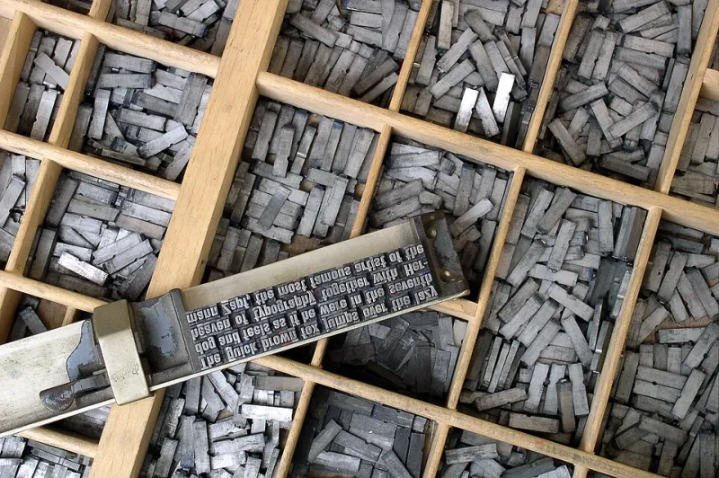
Photo: Willi Heidelbach, CC BY 2.5, via Wikimedia Commons
When Type Is Treated as Decoration, Revenue Suffers
Walk through the digital presence of most mid-market American companies and you will find the same pattern: a headline font chosen because it looked distinctive, a body font selected for readability, and a complete absence of any deliberate thinking about how those choices work together to move an audience toward a decision.
This is not a design critique. It is a business observation. Typography is one of the primary mechanisms through which a brand communicates authority, establishes trust, and guides users through a decision-making journey. When it is treated as an aesthetic variable rather than a strategic one, organizations leave measurable value on the table.
At CBM Design Group, our work with corporate and commercial clients has made one principle consistently clear: the brands that convert at the highest rates are not necessarily the ones with the most visually striking design systems. They are the ones with the most intentional communication hierarchies — and typography sits at the center of that hierarchy.
The Psychology Behind Type Choices
Before examining how typography drives conversion, it is worth understanding the psychological mechanisms at work. Typefaces carry inherent associations that audiences process before they consciously register the words themselves.
Serif fonts — those with the small finishing strokes at the ends of letterforms — are broadly associated with tradition, authority, and reliability. This is why law firms, financial institutions, and heritage consumer brands have historically favored them. Sans-serif fonts, by contrast, communicate modernity, accessibility, and efficiency, which explains their dominance in technology, healthcare, and direct-to-consumer retail.
These are not arbitrary cultural associations. They are the product of decades of exposure, and they carry real behavioral consequences. Research conducted by the Software Usability Research Laboratory at Wichita State University found that serif fonts were rated as more credible in long-form reading contexts, while sans-serif fonts facilitated faster comprehension in digital environments. Neither is universally superior — but each is strategically appropriate in specific contexts, for specific audiences, with specific goals.
The brands that understand this distinction make deliberate choices. The brands that do not simply inherit the default.
Hierarchy as a Conversion Architecture
Typographic hierarchy is the system by which visual weight, scale, and contrast direct a reader's attention through a piece of communication. In a conversion context — whether that is a landing page, a product brochure, or a direct mail piece — hierarchy is not a design concept. It is a sales architecture.
Consider how a well-constructed digital landing page uses type to guide behavior. The headline captures attention and communicates the primary value proposition at a scale that demands engagement. A sub-headline adds specificity, addressing the audience's most likely objection or amplifying the primary promise. Body copy provides supporting evidence in a weight and size calibrated for sustained reading. And the call-to-action is set in a way that is visually distinct — not necessarily the largest element on the page, but the one that stands apart from the surrounding system.
When this hierarchy is absent or inconsistent, the eye has no path to follow. Audiences scan rather than read, miss critical information, and exit without converting. The content may be compelling. The offer may be strong. But the typography has failed to do its structural job.
Leading direct-to-consumer brands invest significant resources in optimizing this hierarchy. Testing different headline treatments, adjusting the weight contrast between primary and secondary copy, and refining the visual prominence of conversion elements are standard practices among high-performing digital marketing teams — because the data consistently supports the investment.
Font Pairing and the Trust Signal
The relationship between fonts in a brand system communicates something beyond aesthetics. It signals the degree of care and intentionality behind the brand itself — and audiences read that signal, even when they cannot articulate it.
A pairing that creates meaningful contrast — a structured geometric sans for headlines alongside a humanist serif for body copy, for instance — communicates that someone made a considered decision. It projects craft. A pairing that simply uses two weights of the same font family communicates efficiency and clarity. Both are legitimate strategic choices, depending on the brand's positioning.
What undermines trust is inconsistency. Brands that apply different fonts across their website, their printed collateral, and their social media presence are telling audiences, implicitly, that no one is minding the store. That impression — even when it registers only subconsciously — erodes the confidence that is a prerequisite for purchasing decisions, particularly in high-consideration categories.
Scale, Weight, and the Digital Reading Environment
The proliferation of mobile devices has fundamentally changed the typographic demands placed on brand communication. A font that performs beautifully in a printed annual report may render poorly at small sizes on a smartphone screen, undermining readability and, by extension, the perception of the brand.
Variable font technology has given designers considerably more control over how typefaces behave across screen sizes and resolutions. Brands that have adopted responsive type systems — where font weight and size scale fluidly with the viewport — consistently demonstrate stronger engagement metrics than those using static type specifications carried over from desktop-era design conventions.
This is a technical consideration with direct commercial implications. If your audience is reading your content primarily on mobile devices, and your typography was designed for a desktop environment, you are creating friction at the precise moment you need clarity.
Building a Typography System That Works
For organizations ready to treat typography as a strategic asset rather than a stylistic choice, the starting point is an audit of the existing system across all active channels. Identify where inconsistencies exist, where hierarchy breaks down, and where the current type choices conflict with the brand's intended positioning.
From there, the selection of a primary and secondary typeface should be driven by three factors: the psychological associations appropriate for the target audience, the technical performance requirements of the primary channels, and the degree of contrast needed to establish a functional hierarchy.
Finally, document the system with enough specificity that it can be applied consistently across every touchpoint — by internal teams, agency partners, and vendors alike. A typography system that lives only in the minds of the design team is not a system. It is a series of individual decisions waiting to diverge.
Type is not decoration. It is the architecture through which your brand's value proposition reaches the people most likely to act on it. Treat it accordingly.